Monday, 29 April 2013

Game Analysis

We have been asked to analyse 3 games, focusing on the constituent part of the game.  (Conflict, aesthetics and what purpose the game serves).

The games are:
  • LA Noire
  • Spore
  • Dear Esther

 LA Noire

Structure:

Conflict within the game often arises when the player is confronted by an uncertainty about who the criminal is. Often trying to investigate conflict is present when confronting innocent people, or the criminal themselves. Due to being a single player game the player is only confronting npcs, rather than other people.

The game offers interactive experiences in the form of objects, and npcs. Both may be interacted with in order to find clues and obtain information. These lead the player hopefully towards the correct conclusion and form part of the meaningful play crucial to the game outcome.

Aesthetic:

The style is clearly from the 1940s, drawing on film noire references, even including a black and white style if the player wishes.


Spore

Structure:

Conflict within spore is mainly focused on survival and food consumption. With other npcs vying for better positions within the food chain you must either defend yourself or chase other species down. With this in mind it is clear to see the focus is on player vs game rather than other players.

The player interacts with both the environment and the other organisms within it. By means of travel and combat, as well as a source of food. All of this is mostly focusing on survival initially, however this changes as the game progresses and becomes more social based. These work to create meaningful play, educating younger children about evolution and how life develops, even if it is simplified.

Aesthetic: The style is cartoony, appealing to children, with many cute sounds and animations to appeal to this audience.


Dear Esther

Structure:

The only conflict within Dear Esther is the environment, potentially confusing the player on where to go, especially within the crystal caves. However possible conflict is also represented within understanding the deeper message the game has to offer, where the player must try to challenge the game to receive more information, via exploring. Also some audio is randomly played in different playthroughs, showing the game withholding parts of the story until played again. This is mainly an internal struggle with the game and the player, however outside the game some players argue over what the true meaning of the game is, so there is slight player conflict.

The only player interaction is via exploration, and in turn knowledge gathering. However there is limited meaningful play, with very little to "play" in the game.

Aesthetic:  The style is realistic, with limited physical interaction with the environment it is important to have a visual interaction, with many interesting scenes to view.

An example of the beautiful landscape during the ending cut scene.

Sunday, 28 April 2013

Factory Windows

Wanting a factory style window design I chose one which best suited the shape of the window frame.

http://freetextures.3dtotal.com/library/free_textures_640/Architectural/Window/xIMG_0277_640.jpg.pagespeed.ic.EdM7Z2riek.jpg
Windows within Maya

How they appear in UDk

More Factory Progress

After transferring the model into UDK I found there to be a few problems, including stretching on certain faces which were not visible in Maya due to their size.


 These were then fixed, deleting the faces which were not required and manipulating them to better fit the diffuse map.

Factory Progress

I started creating the windowed part of the factory earlier this week, this is how it went so far. Firstly I created the main size and shape of the building using a human scale, when happy with this I began modelling the windows and frames. After this I created the supports which go either side of the windows.


This is what I expect the factory section to look like when finished.

Monday, 15 April 2013

BA6: Factory Research

As Steampunk is based on what Victorian predictions of the future I thought it may be interesting to look at more modern factories, even if that is not necessarily how I expected them to look!

Metal pipes and frames give the factory an almost Steampunk feel already, combined with brick and the Victorian architectural style the factory should have the correct design and theme! Large metal cylinders which have slightly rusted also add to the Steampunk genre and will be included if possible.

Overall the research so far has given a general feel and design influence ready to start designing the factory itself. Important features will include:

  • Made of brick
  • Repetitive windows
  • Painted advertisements on walls
  • Tall walls
  • Pipes running along walls
  • Metal frameworks
  • Metal cylinders for storage of liquids
  • Overall run-down feel with rusting and decay

BA6: Victorian Factory research


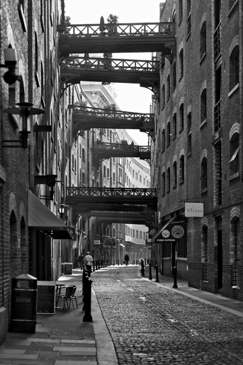
Looking at old factories shows the simple yet important details I will need, they are made of brick, with windows repeated multiple times. This is probably down to the ease and simplicity of the design to be replicated and extended. Painted branding on the walls was also an interesting feature which has since been lost.

BA6: Game Research

I started with researching the Exteriors of factories in the steampunk game Dishonored.


Most striking about the images is the extensive use of pipes on the buildings, as well as the painted advertisements on their walls. Decay and evidence of the factories being used is also an important detail. The shape of each of the buildings is tall and gives the impression of power and stability, most remain intact after flooding and neglect.

BA6: Introduction

I decided to continue with the theme of steampunk for the next project, however I wished to focus more on the architecture of Victorian factories. With this in mind I decided to make the exterior of a Steampunk inspired Victorian factory.